Hello everyone!
Per a few minutes ago, the VRM Portal has been improved. The main goal behind this redesign is to better handle managing multiple installations. I'll briefly explain the changes:
The new main table
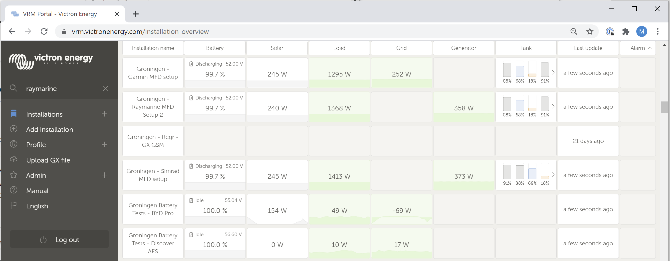
First of all, the amount of clutter has been reduced, and by having it organised in a table with very clear headings, its very quick to understand what part of the system(s) is doing what. The headings are made as common language as possible: no tech-talk. The are Battery, Grid, Load, Solar, Generator and Tanks.
Then the sorting was modified: installations with an active alarm are now shown at the top. And, hovering with your mouse over the alarm status on the right shows a tooltip with details of the raised alarm(s).
Installations that were last seen three months ago, and longer, are moved to the bottom of the table - making space for the more active items.
Also its sortable, by clicking the table headings, and sparklines (small graphs in the box) give a bit of extra information.

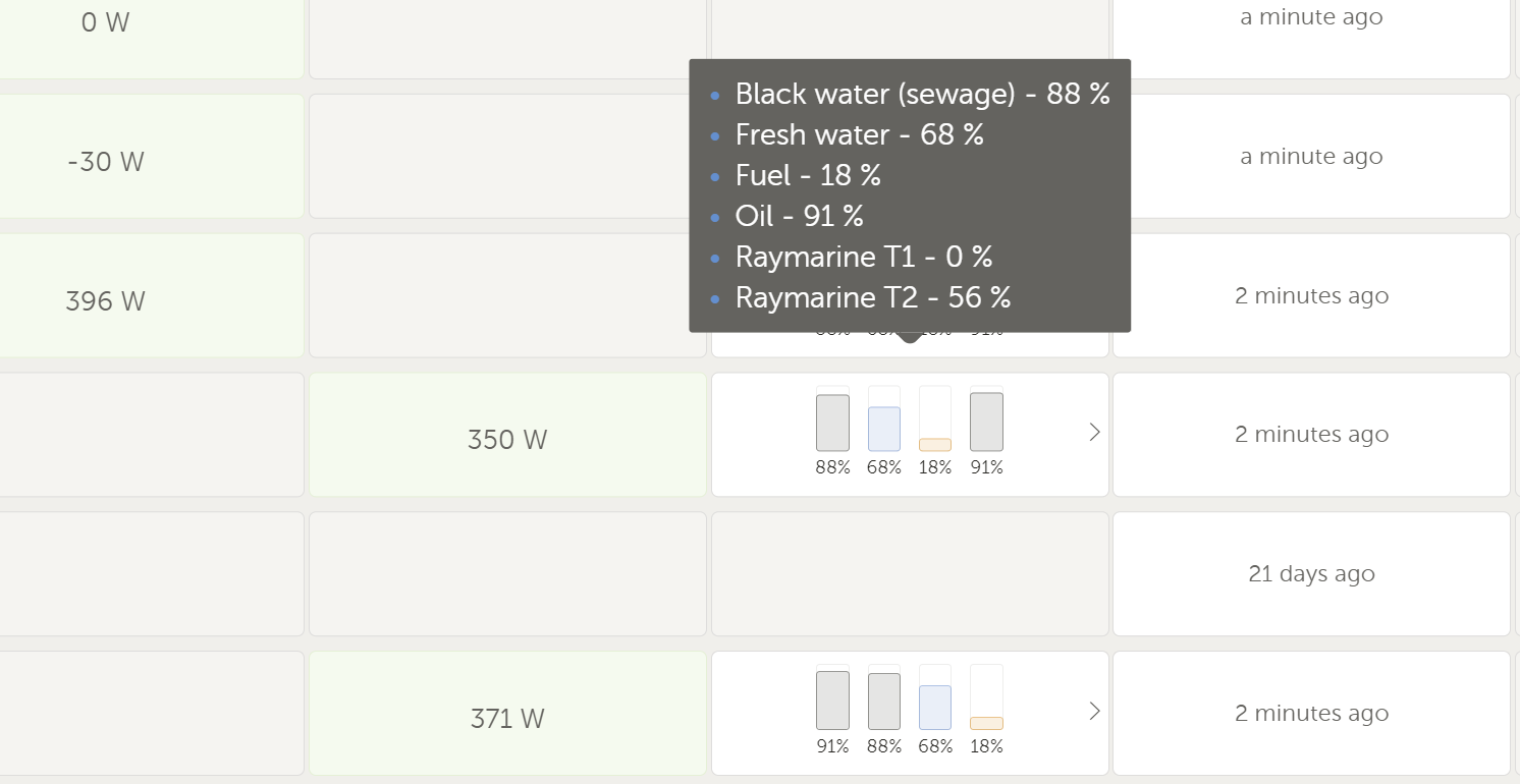
Hovering over the tank box shows all tank data in detail:

Color coding boxes with green vs red
For some cells in the table, portal determines if they need attention or not, and makes that clear by making them green versus red.
- Grid: if there is an active no grid alarm, the cell will be red, otherwise green. (see Cerbo GX manual for what that alarm is and how to enable it)
- Load: if the inverter is switched on, and its off, the cell will be red. otherwise green.
- Generator: if the generator is supposed to be running, but its not (fuel empty, starting issue, otherwise) then the cell will be red; otherwise green. See Cerbo GX manual for how the alarm with regards to automatic generator start/stop works in detail.
Seeing all active alarms
By clicking on the top of the VRM Portal, you see an overview of all currently active alarms. Until now, this wasn't available at all. You'd have to go into an installation to see its active alarms, and go to the next to see them for that one. Here is a screenshot:

Detailed mode and column configuration
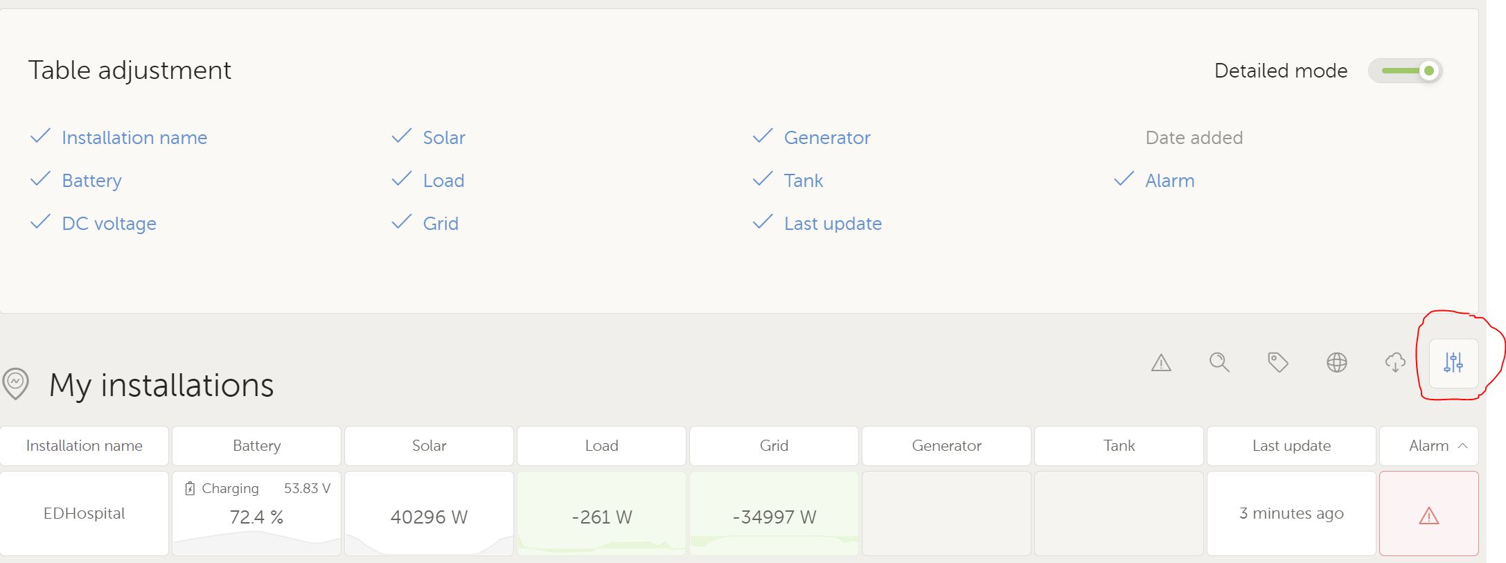
On the top right there is a button that will open a configuration pane. Here is what it looks like:

Enabling / disabling the detailed mode will show/hide the spark lines.
Thats all for now. If you have any ideas, see any issues, have a question, comments or just a compliment to the developers that have been working hard to get it to this level, welcome to drop it below.
All the best, Matthijs
