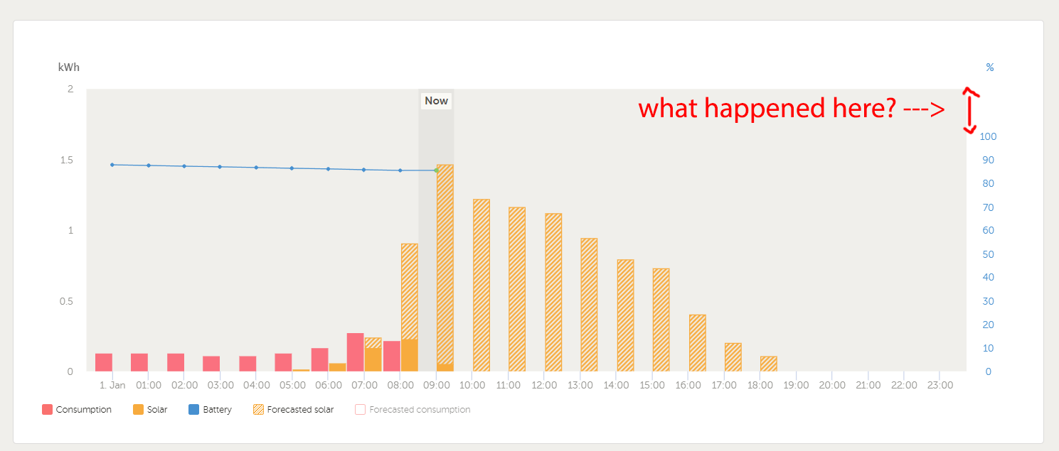
In the graph on the vrm site showing consumption/solar/battery, until recently 100% battery was the top of the chart. This was very useful because it meant that at a glance you could see immediately if the battery level was unusually low. But a couple of weeks ago some redesign occurred and now there is a gap of empty space at the top of the chart. This is really annoying as it makes it much harder to determine whether the batteries are at 100% or not, since there is no visual marker on the chart for where 100% actually is any more. At the very least there should be some kind of horizontal grid line indicating where 100% is.

