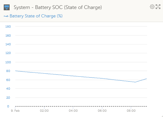
It makes reading/comparing difficult when the y-axis of the SOC graph goes above 100% - sometimes to 180%. Its not necessary
- Home
- Anonymous
- Sign in
- Create
- Spaces
- Grafana
- Node-Red
- Unsupported topics
- Questions & Answers
- Modifications
- Communauté francophone
- Deutschsprachiger Bereich
- Preguntas en Español
- Explore
- Topics
- Questions
- Ideas
- Articles
- Badges
question
Can you limit the SOC graph to max 100% on the y-axis?
1675926781293.png
(16.0 KiB)
Comment
1 Answer
Hi @Stuart Bell
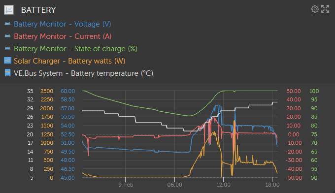
Yeh, that's a weird example. But the VRM devs have concentrated their improvement efforts into giving us Custom Widgets. So you can set up your own. This is one I did for myself..

The trick with multiple traces is to avoid multiple scale lines and the figures split into weird gradations. Give it a try, you'll get the hang of it.
1675928441236.png
(61.8 KiB)
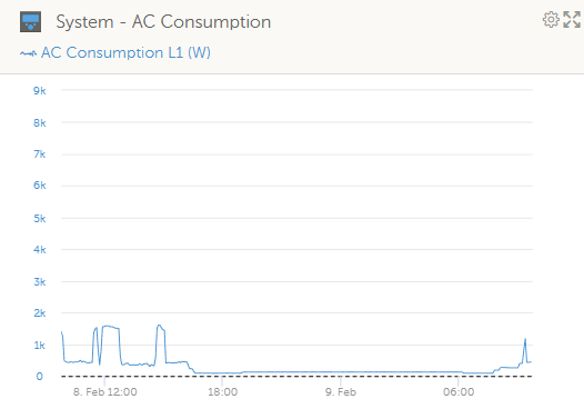
Hi - thanks for the suggestion... may have to go that route as I also get odd ones like this - again makes it hard sometimes to see the detail you need!

1675928988764.png
(15.9 KiB)
Related Resources
Additional resources still need to be added for this topic
question details
33 People are following this question.
