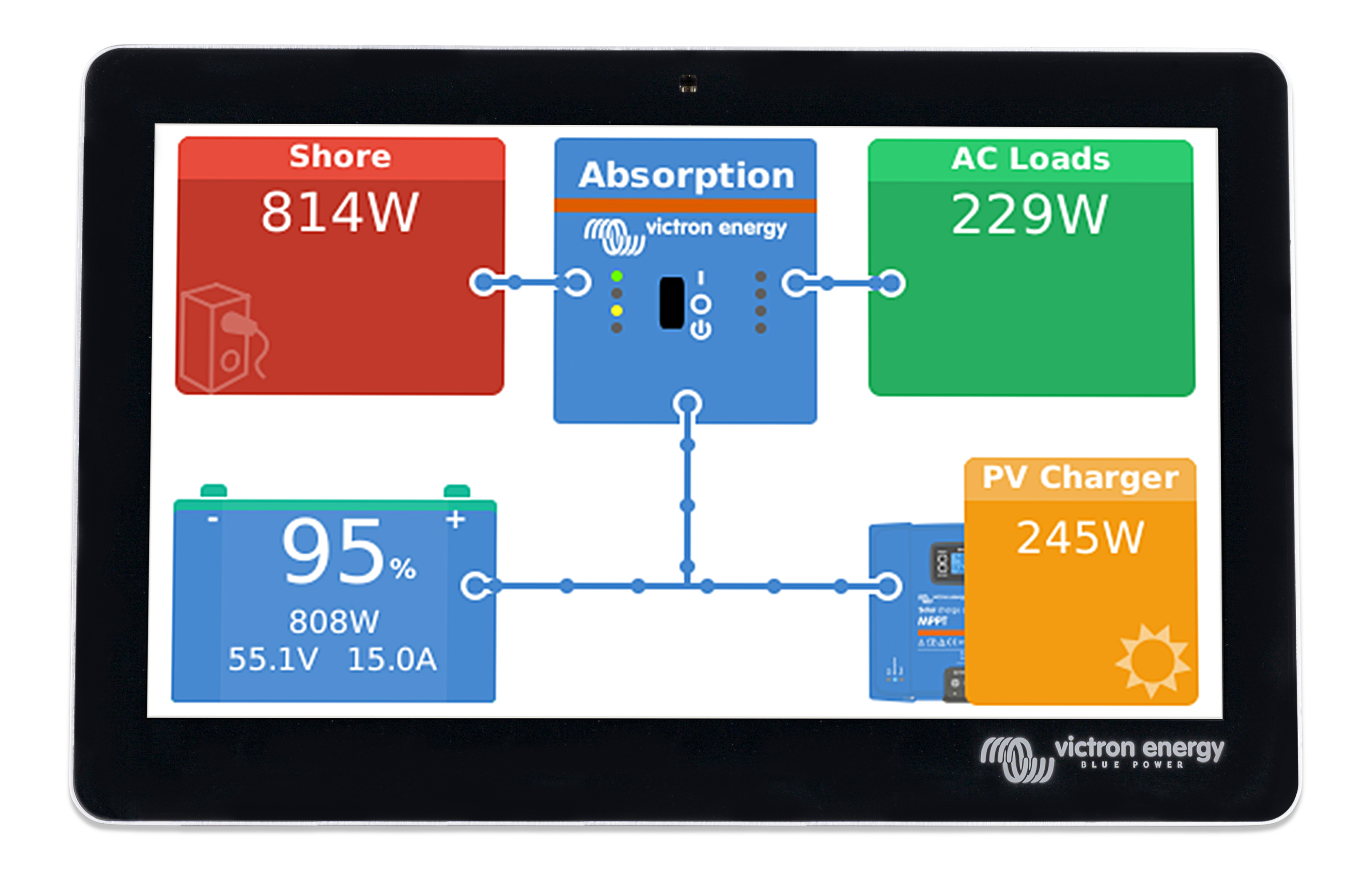
Hi Victron Team
Is there any plan to provide a Dark Mode of this screen in future releases ?
Kind regards
Tim
This site is now in read-only archive mode. Please move all discussion, and create a new account at the new Victron Community site.
Hi Victron Team
Is there any plan to provide a Dark Mode of this screen in future releases ?

Kind regards
Tim
Nice idea I would like that too.
I forwarded it to the developers.
For the default Victron Style it's easy if you're able to modify files via FTP.
To make it "quick and dirty", you can do that for the main screen with the following changes. Settings and so on are still default.
>>>>>>>> MAKE BACKUPS FROM YOUR ORIGINAL FILES! <<<<<<<<<
You'll find the files to be modified in the directory: /opt/victronenergy/gui/qml
------------------------------------
overviewHub.qml
------------------------------------
find:
title: qsTr("Overview")
and paste this directly after that line this code:
    // modification for dark background start
        Rectangle
            {
                anchors
                {
                    fill: parent
                }
                //color: root.backgroundColor
                        color: "#000000"
            }
    // modification for dark background end
----------------------------------------------
overviewConnectionEnd.qml
----------------------------------------------
to make the borders from the connections black:
Find this section:
  Circle {
        id: ball
        radius: root.radius
        color: "#4789d0"
        x: -radius
        y: -radius


        border {
            width: 2
            color: "white"
        }
    }
and change for border the line:
color: "white"
to
color: "black"
------------------------------------
Battery.qml
------------------------------------
to remove the white frame around the battery...
find that line:
border {width: 2; color: "white"}
and change it to
border {width: 2; color: "black"}
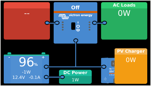
Thats it! Now it should look like this:
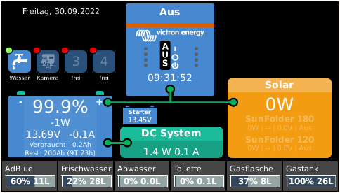
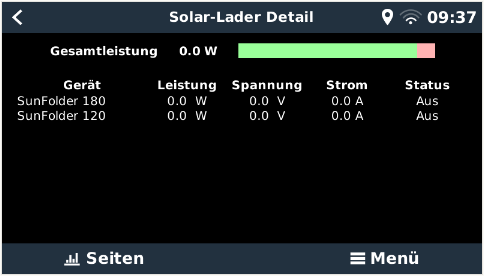
If you're using the GUIMods from Kevin Windrem, it's a little bit more work and not that easy, but it could look like this:
...
Be careful editing Files and make backups before!
yes, I did a lot of customization. For the starter-battery you need to modify only "some" lines inside the overviewHubEnhanced.qml.
I show you the way I did it (it may vary on your system, depending from where the battery voltage is coming):
FIRST: MAKE BACKUP OF YOUR FILE(S) !!!
first you have to add the following line in the section where the VBus Items were declined (check on what USB port your device is, that sends the voltage. In my case it is on ttyUSB3):
VBusItem { id: starterBatteryVoltage; bind: Utils.path("com.victronenergy.battery.ttyUSB3", "/Dc/1/Voltage") }
I've added it after this line:
VBusItem { id: timeToGo; bind: Utils.path("com.victronenergy.system","/Dc/Battery/TimeToGo") }
Now you have to draw the battery and fill it with data:
add at the end, before the line:
function showHelp ()
this code (play with the x and y coordinates to place it on the screen, where you need it):
// Show Starterbattery
Rectangle
    {
        id: buttonStarterBattery
        // below 12.5V the battery will change color to orange
        color: starterBatteryVoltage.format(2) < 12.5 ? "#ff9900" : "#4789d0"
        width: 50
        height: 25
        border {width: 1; color: "black"}

           x: 172
           y: 156

        visible: true
    }

Rectangle
{
        id: buttonStarterBatteryPole
        color: "#4789d0"
        width: 5
        height: 2

            x: 177
            y: 154

        visible: true
}
Rectangle
{
        id: buttonStarterBatteryPole2
        color: "#4789d0"
        width: 5
        height: 2

            x: 212
            y: 154

        visible: true
}

TileText
    {
        text: "Starter"
        color: "white"
        font.bold: true
          anchors{
           top: parent.top; topMargin:2
           fill: buttonStarterBattery
          }
        wrapMode: Text.WordWrap
        font.pixelSize: 8
        show: true
    }
TileText
    {
        text: starterBatteryVoltage.format(2) + "V"
        color: "white"
          anchors{
            top: parent.top; topMargin: 12
            fill: buttonStarterBattery
          }

      font.pixelSize: 10
      show: true
    }
Save the file and restart the GUI. You can do that from a terminal session with:
svc -t /service/gui
If you have trouble (white screen), open a second terminal and start a debugger:
tail -f /data/log/gui/current | tai64nlocal
This is the way I did it - maybe it could be easier to "draw" the battery, but it works for me.
Hi itsme,
i have made your edits to the files and connections and battery frame are black now, but the main background of the hub remains white
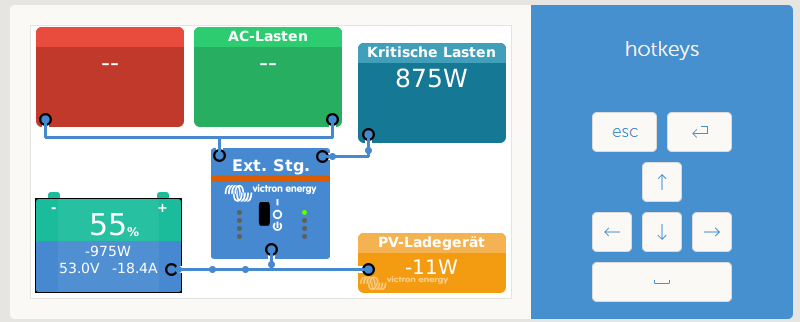
When i restart the venusos the Background is for a brief moment black and shows the victron mppt picture behind the yellow PV tile, like this:

but then the page reloads with a progress bar, the background turns white again and the blue mppt behind the pv loader is gone. I´m on FW 2.93.
Any idea, why its not working?
EDIT: I found the reason why i didnt work for me.
Depending on configuration there are different qml files loaded. Since my configuration is ESS (Grid Parallel) the file to be edited is OverviewGridParallel.qml and not overviewHub.qml like in the example. Now it works :-)
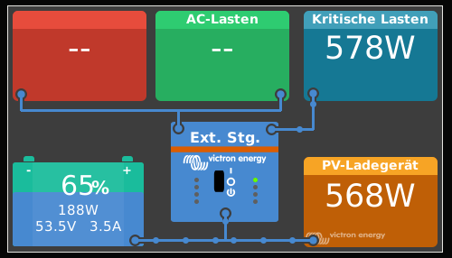
Thank You
Nothing to announce yet, but it is a very popular feature request :)
@Guy Stewart (Victron Community Manager) @Matthias Lange - DE @mvader (Victron Energy)
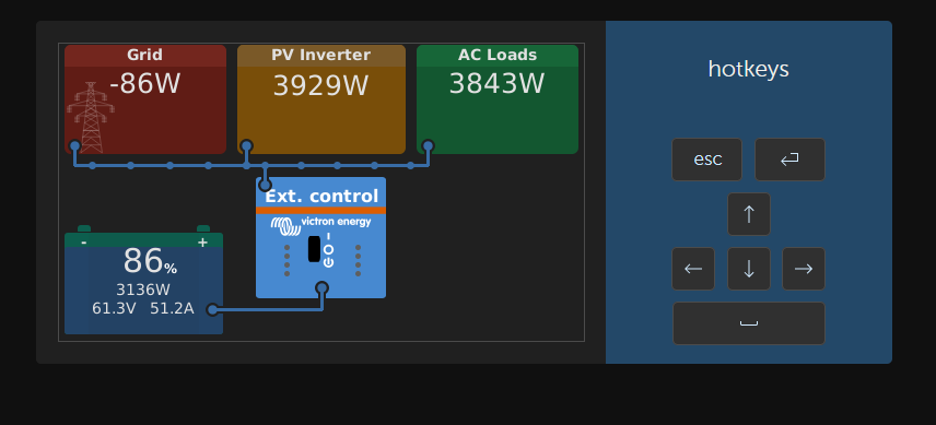
I'm making a dark mode that is applied with GuiMods, but I see that in many QML files no colors are given for the font. This results in many file changes and high maintenance for the addin.
Would it be possible to collaborate with you guys to maybe even implement my darkmode directly in Venus OS?
If you don't want that others add code to Venus OS, would it at least be possible to not define colors, like the text color, in many places but take them from the MbStyle.qml?
In the case that it's possible to contribute by sending you the changed QML files it would be great!
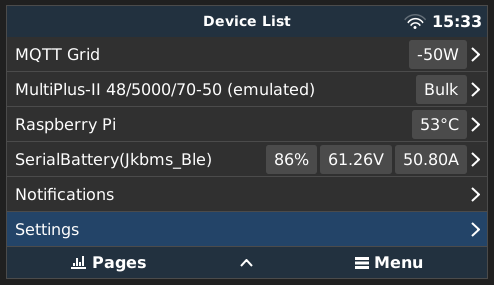
Here some impressions:
perhaps you can send me an email?
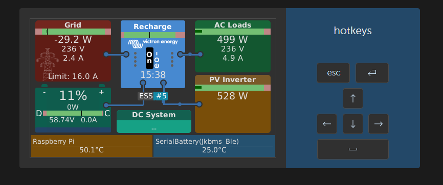
Since there is not much happening here, I'm working on GuiMods to add a setting, where you can turn on/off dark mode. Once finished it will also be available for the Victron Stock overview.
Here a little preview:
Thank you Sir! Are you just able to change the white for black I like how the other colours pop, just the white background is glaring. how would this be implemented and any chance of Victron implementing it as a factory toggle option in settings @Guy Stewart (Victron Community Manager)
I will not use black for many reasons, but I can use a darker gray. You can change to light/dark mode by toggling the switch.
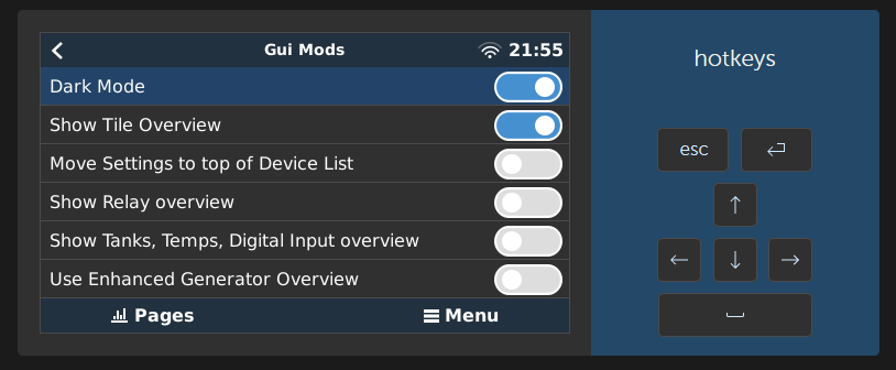
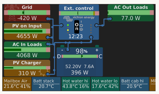
I really like this new dark mode! Thanks!! Noted that it works also on remote console.
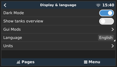
HOW TO:
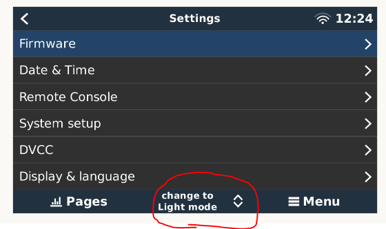
This button is not accessible with the physical buttons. You have to go to Settings > Display & language > Dark Mode to change it.
Would someone be kind enough to tell me how to add an extra screen to the overview screen. I would like to add some sockets for my van so I can easily see if I have left them on. I have tried various things. To get them to appear on the touch screen without much success. I started with copying overviewgenerator.qml renaming it. Just trying to get another overview screen to appear. I haave read some advice editing on PageMain.qml. I could just do with some pointers. Any help greatly receieved.
Additional resources still need to be added for this topic
The feature requests topic tag can help Victron R&D find feature suggestions for products.
There are many factors that go into the Victron product roadmap, and feedback from end-users can help.
53 People are following this question.