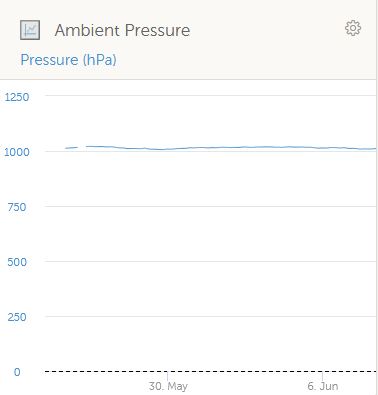
The new custom widgets are amazing - but I am missing one important thing: to scale the y-axis as I wish. When I am plotting the ambient pressure (from a RUUVI sensor) and want to see the trends, the automatic scaling from 0 is pretty useless.
This site is now in read-only archive mode. Please move all discussion, and create a new account at the new Victron Community site.
The new custom widgets are amazing - but I am missing one important thing: to scale the y-axis as I wish. When I am plotting the ambient pressure (from a RUUVI sensor) and want to see the trends, the automatic scaling from 0 is pretty useless.

It’s a feature with the development team right now :)
is there any news on this?
at least a confirmation that it will be done in future?
I really would love to see e.g. 3 curves using the same y-axis
thank you!
At internal test phase right now;
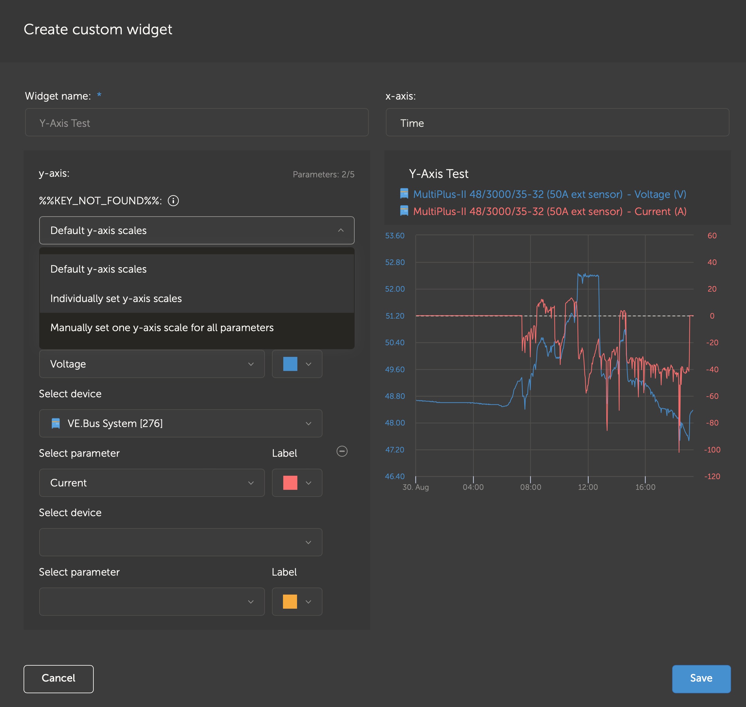
similar issue: 5 temperatures (4x Ruuvi 1 Battery sensor) in 1 graph, with (unnecessary) different y axis scales
Yes, correct, this is another issue - unnecessary different y axis range for similar values (here my example of humidities)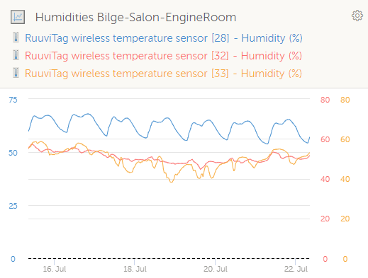
or better a switch between an automatic maximum value and manual user value?
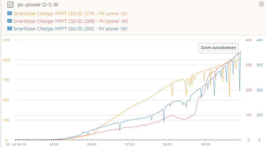
in the following exemple an overall maximum value would be perfect...
at the moment... East 1250W / South 400W / West 400W
better... East 1250W / South 1250W / West 1250W
38 People are following this question.