Idea

Kevin Windrem avatar image
Kevin Windrem suggested

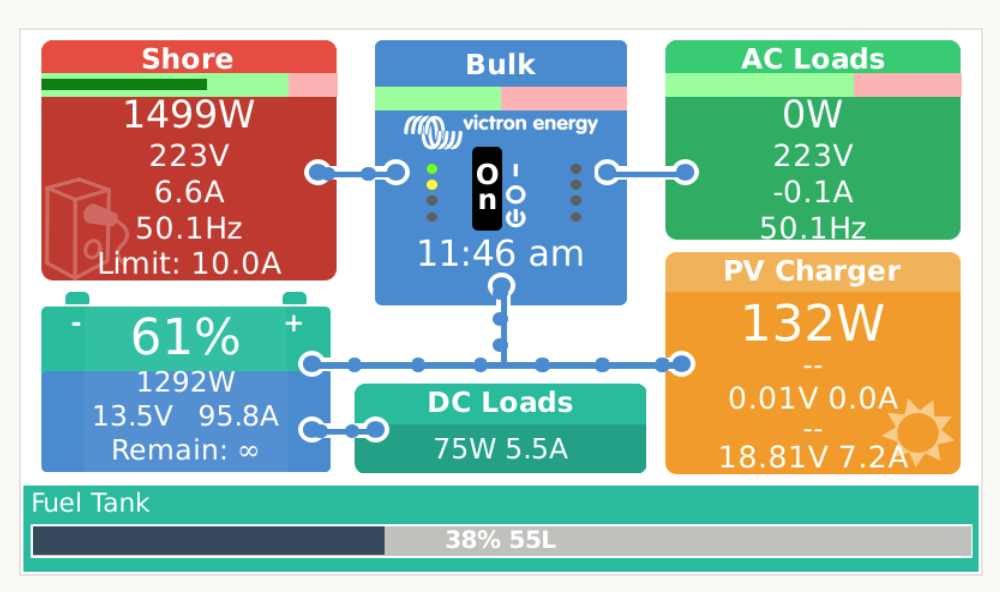
Changing inverter mode and AC current limit from Flow Overview

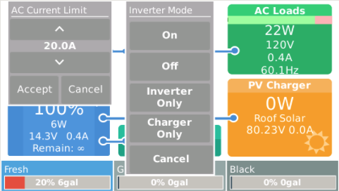
I have added popups to the Flow Overview that allow adjusting the AC input current limit and inverter modes.

The following screen shot shows both popups active but this will probably not be the case in practice.
flow-overview-popups.png

There is no space available on this screen for dedicated buttons, so you need to touch hidden areas to activate the popups: the bottom 1/3 of the AC Input tile and the middle of Multi tiles. The touch area was purposely limited to minimize conflicts with tap to activate the bottom bar and to swipe between overviews.

The current limit popup is a clone of the one used for the AC CURRENT LIMIT button on the Mobile Overview page.

The inverter mode popup is all new and presents a set of buttons to change the inverter mode when touched. This differs from the AC MODE button on the Mobile Overview page which cycles through available modes with each press.

This enhancement is part of my GuiMods package:

https://github.com/kwindrem/GuiMods


Venus OS
4 comments
2 |3000

Up to 8 attachments (including images) can be used with a maximum of 190.8 MiB each and 286.6 MiB total.

Really nice addition, especially the inverter modes. Makes it super easy for my co-owner, who is not tech-savvy. Thanks!

bildschirmfoto-2021-05-16-um-114634.png

0 Likes 0 ·
Stefanie (Victron Energy Staff) avatar image Stefanie (Victron Energy Staff) ♦♦ Stefanie (Victron Energy Staff) ♦♦ commented ·

@Kevin Windrem,

how about giving the actual inverter mode a different color other than grey, so that one can see on a glance (when the popup is visible) which mode the inverter is switched to?


0 Likes 0 ·
Show more comments
Kevin Windrem avatar image
Kevin Windrem commented

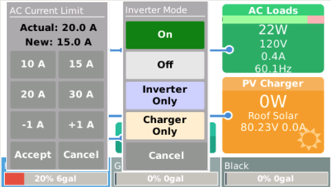
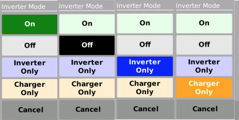
I'm experimenting with colors that might help identify the current mode and to aid in choosing the new mode. Do the pastel colors for the unselected mode help or would gray for all three be better? Comments please.

screen-shot-2021-05-24-at-80449-am.png


5 comments
2 |3000

Up to 8 attachments (including images) can be used with a maximum of 190.8 MiB each and 286.6 MiB total.

Yes to pastel colors. It adds a much better contrast compared to white on grey. I personally like the peach and mint colors.

0 Likes 0 ·
rmaddy avatar image rmaddy commented ·

I setup mine with the original gray buttons and white text and I used the battery blue color for the currently selected mode. That battery blue looks really nice next to the gray. I like that blue better than the two blues shown in this proposal. I also find the black Cancel text on this proposed darker gray button too hard to read. For that dark of a gray it is easier to see white text.

Picking colors is tough. It's been the hardest part of building my trailer too. :)

0 Likes 0 ·
Kevin Windrem avatar image Kevin Windrem commented ·

I'll change Cancel to white text, so you'll only see black text on the pastel colors.

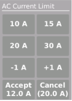
I have one more enhancement I'm working on. I dislike the current limit spinner. It's so difficult to quickly get to the desired level and it's something I change a lot: 30 amp, 20 amp shore power then generator power based on altitude ...

So.....

screen-shot-2021-05-24-at-104530-pm.png

The top 4 buttons are presets which you can define in the setup script when installing.

The -1 and +1 buttons are spinners (like the original current limit dialog. (Press and hold works.)

Accept shows the new current while making changes, Cancel shows the current actually being used. So to get to the 12 amps, I press 10 followed by +1 twice, then Accept.

The original spinner incremented by 0.5 amps. This one increments by 1.0. Any need for the 0.5 amp finer granularity (maybe in the 220 volt world)?

0 Likes 0 ·
rmaddy avatar image rmaddy Kevin Windrem commented ·

I like this a lot. I'll only ever need 15A or 30A so this is way more user friendly over the stock spinner. Nice extra touch letting people define the 4 top buttons. Those with 50A shore power can set values accordingly as can those, like me, with 30A shore power.

Would it make sense to highlight one of the 4 main buttons with the same color you use for the inverter mode if the button happens to match the current limit? So in your example, in addition to showing (20.0A) under Cancel, highlight the 20A button.

If you do go with the -1A and +1A buttons there is probably no reason to add the decimal point under the Accept and Cancel buttons.

0 Likes 0 ·
Kevin Windrem avatar image Kevin Windrem Kevin Windrem commented ·

rmaddy, thanks for your input.

I've made the change to highlight the preset button if it matches the new value (or the actual value of no new value exists yet).

I also disable and hide the buttons if you enter a value of 0. This might help reduce clutter if you don't need 4 presets.

0 Likes 0 ·
Kevin Windrem avatar image
Kevin Windrem commented

I've put the mods to the two popups on GitHub:

https://github.com/kwindrem/GuiMods
Preset values are set during package installation (setup script), or you can change them via dbus-spy.

The AC current limit popup shows actual and new values, then 4 user-defined preset, "spinner" buttons to adjust values between presets and finally Accept and Cancel buttons.

flow-overview-popups.png

2 |3000

Up to 8 attachments (including images) can be used with a maximum of 190.8 MiB each and 286.6 MiB total.

Your Opinion Counts

Share your great idea, or help out by voting for other people's ideas.