I’ve used a few on-line data logging systems and to give credit where it is due the VRM is pretty good.
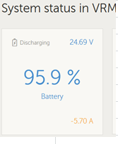
But I would like to query the quality and clarity of the end-user graphics, as seen on customers screens. For example this is a screen shot of the System Status in VRM on my iPhone display.

Is there a brand or focus group determined reason why the Battery % number is large and (moderately) clear and yet the V and A are tiny text and in faint font ? I don’t need to wear glasses but I do have to squint and focus to read the small numbers.
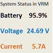
When using the VRM I think users want clear, crisp easy to read information, something more like this.

