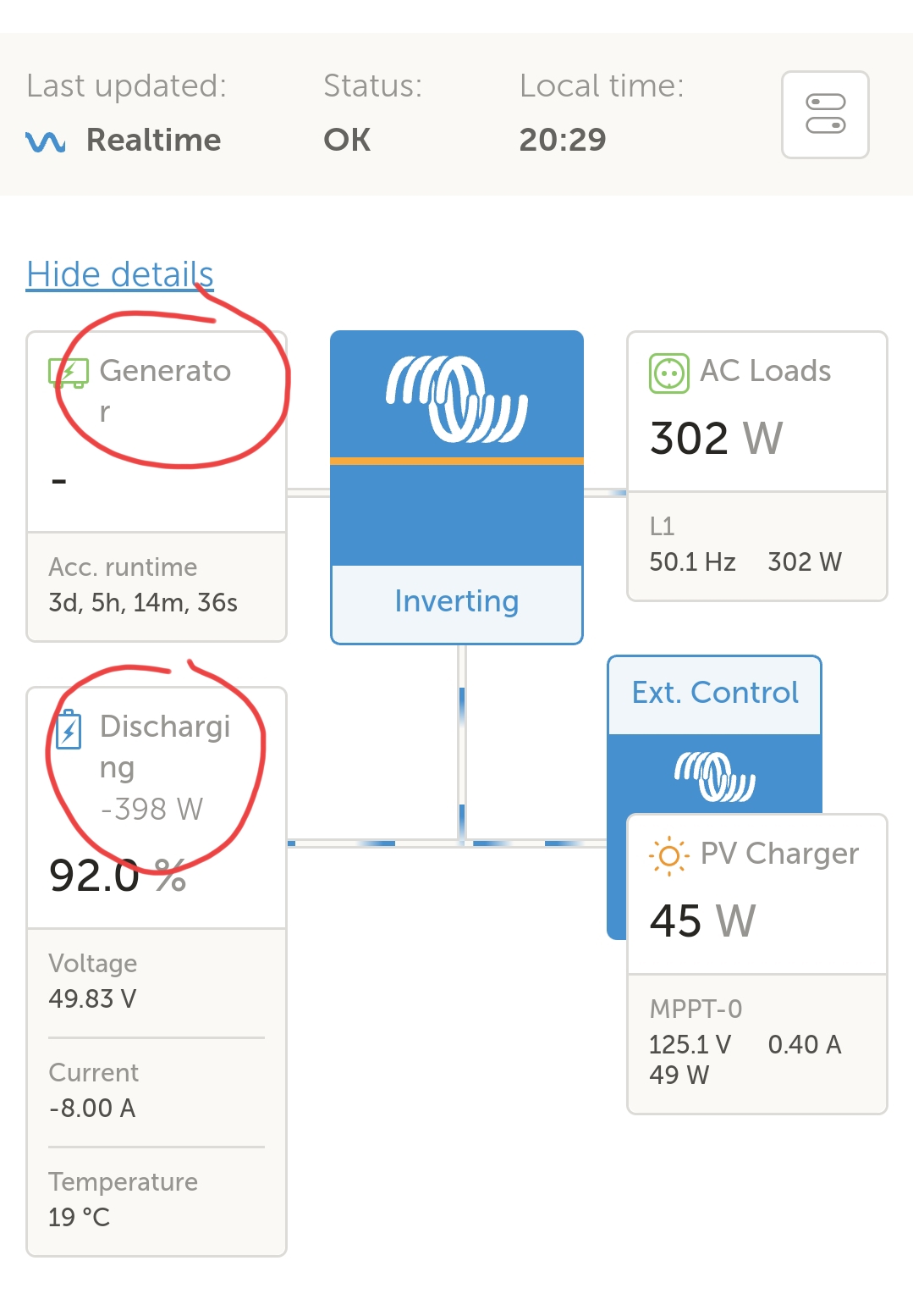
Really minor issue to report but kind of takes the polish off the VRM dashboard.
The input "Generator" and the "Discharging" state of the battery wrap over two lines when viewing the dashboard on a smartphone.
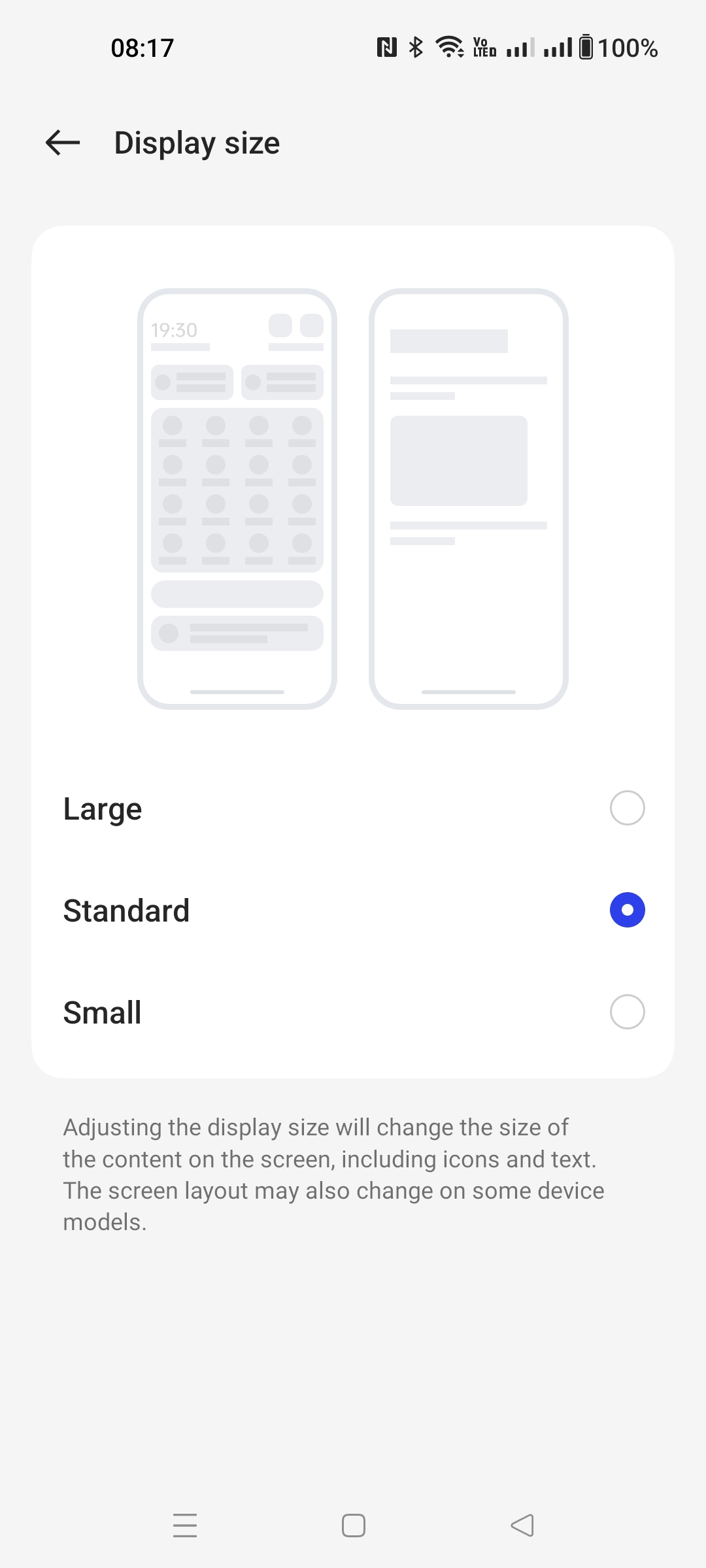
This is on a phone with a pretty typical sized screen.


