Hi,
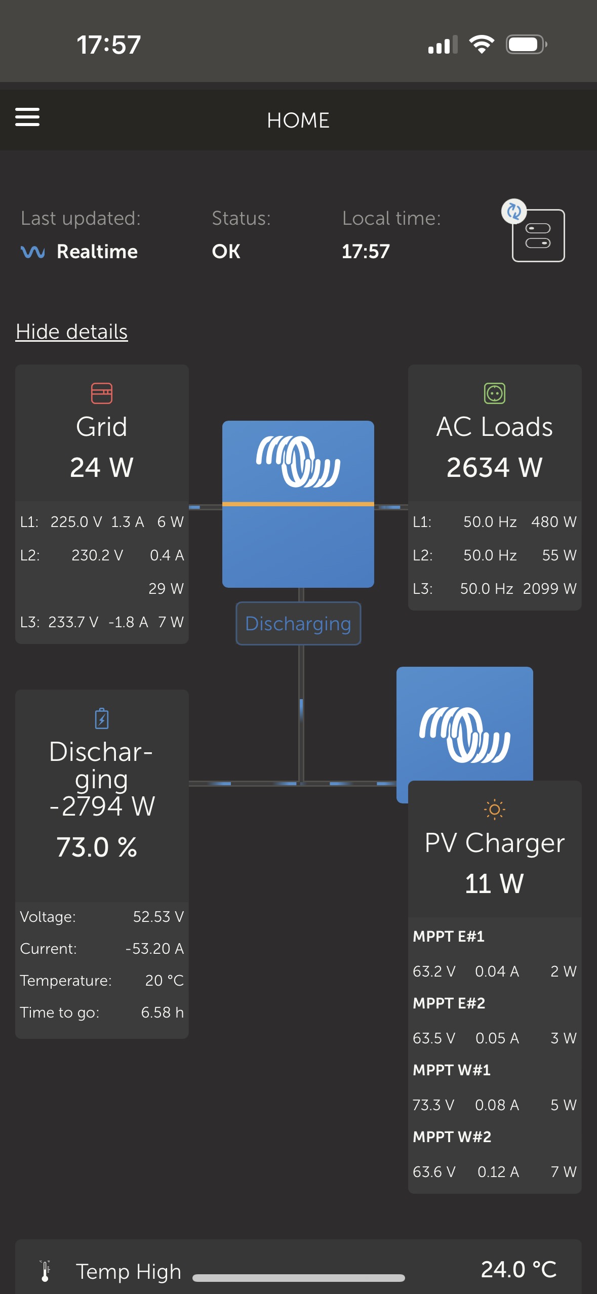
I would kindly ask our dear friends att Victron to take a look att detailed view shown on iOS VRM.
In Grid, PV Charger and Battery fields, data rows are very often splited into 2 lines due to lack of space in their window.
Word "Discharging -XXX W" is also broken into multiple lines and does not look good. Not really sure if words "Charging/Discharging" are necessary, +/- sign may be sufficient in order to save space.
I would suggest to make blue "inverter" icon in the middle slightly narrower and make some more space for data windows, I would guess it will work correctly with 1or 2 more characters in line.
Same thing happens in PV window as well.

