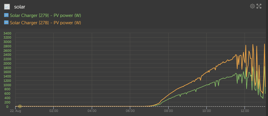
Maybe this is just me but as of a couple of days ago, the VRM graph has a couple of bugs--
1. My custom plot will not use the right colors for the line graphs for both datasets even though they are configured properly. I deleted and remade them as the issue persists. Here is a screenshot. You can see the correct yellow color at the left axis.

2. One one dataset is plotted correctly while the others graph as zeros. You can see below that the data values for the other sets are shown but the graph is 0 for them. Also, look at the voltage values on the y-axis!!


