
Given the following graph showing the "System overview". I have marked the interval 12:00-12:59 blue.
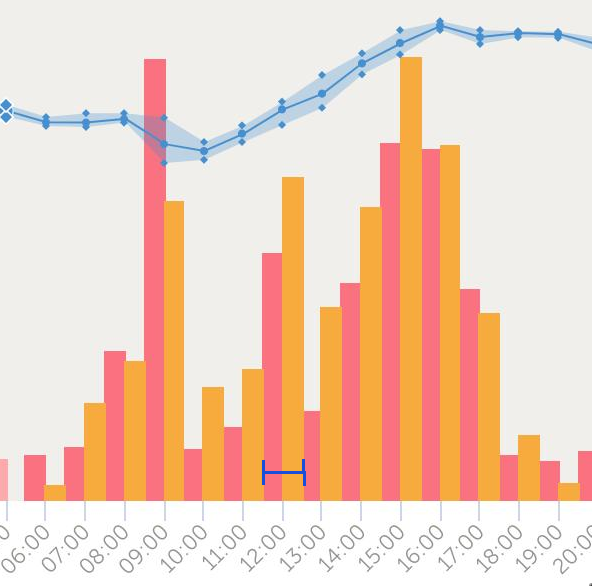
The x-axis basically shows a +30m offset, so unless you hover with a mouse over the graph you would not know which consumption and solar graphs belong together. Or - worse - assume a different pair.
Certainly there must be someone at Victron with some basic UI/UX understanding and it shouldn't be that hard to get this basic functionality right.