
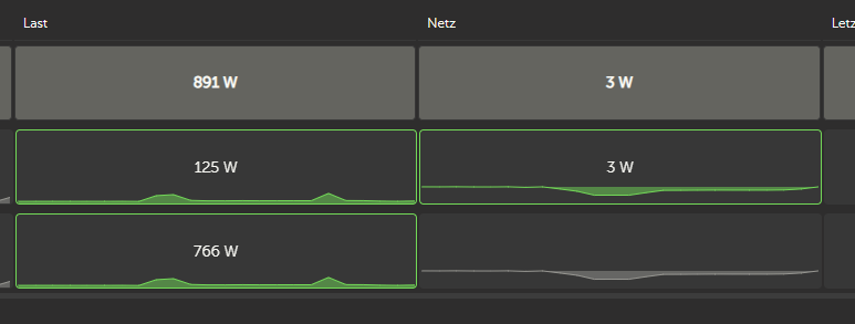
Sorry if this was asked before but I couldn't find anything. If I enable the "Detailed mode" in "Table adjustments":


I see exactly the same graph for both of my installations:
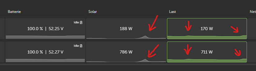
Which is very unlikely. Is it just me or do others have the same effect?
This site is now in read-only archive mode. Please move all discussion, and create a new account at the new Victron Community site.
Sorry if this was asked before but I couldn't find anything. If I enable the "Detailed mode" in "Table adjustments":
I see exactly the same graph for both of my installations:
Which is very unlikely. Is it just me or do others have the same effect?
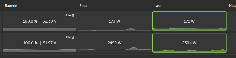
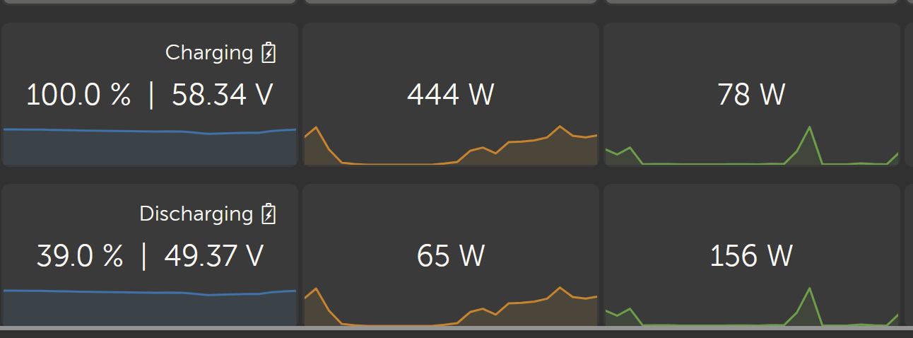
Update: After a while the graphs changed to what I was expecting:
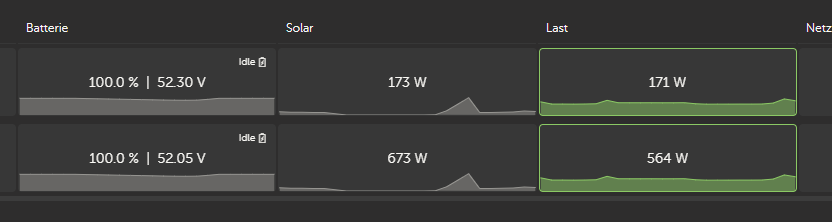
But if I reload the page both graphs are the same again (both show the graph of the first installation):
I have to come back to this - no feedback so far.
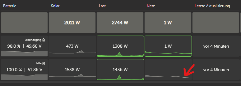
Still the same graphs for both sites when I start VRM - even the grid of site 2 shows a graph although actually not connected:
As this doesn't seem to bother any one else but me can at least someone confirm if this is only me experiencing?
Hi,
I only looked at this mini graph option when the 'new improved' update was annouced a few weeks ago. It's not a big deal for me but I can report seeing exactly the same as you. Occassionally it flips to show the correct graphs for installation 2, but mostly I simply see the same installtion 1 graphs on both.
If this is a valued aspect of the installation overview then you would think this would be picked up as a 'bug' somewhere. If it is something to do with our settings then I have no idea how to sort it.
David