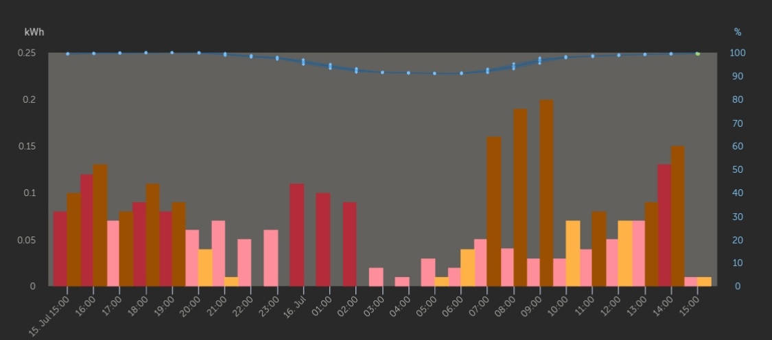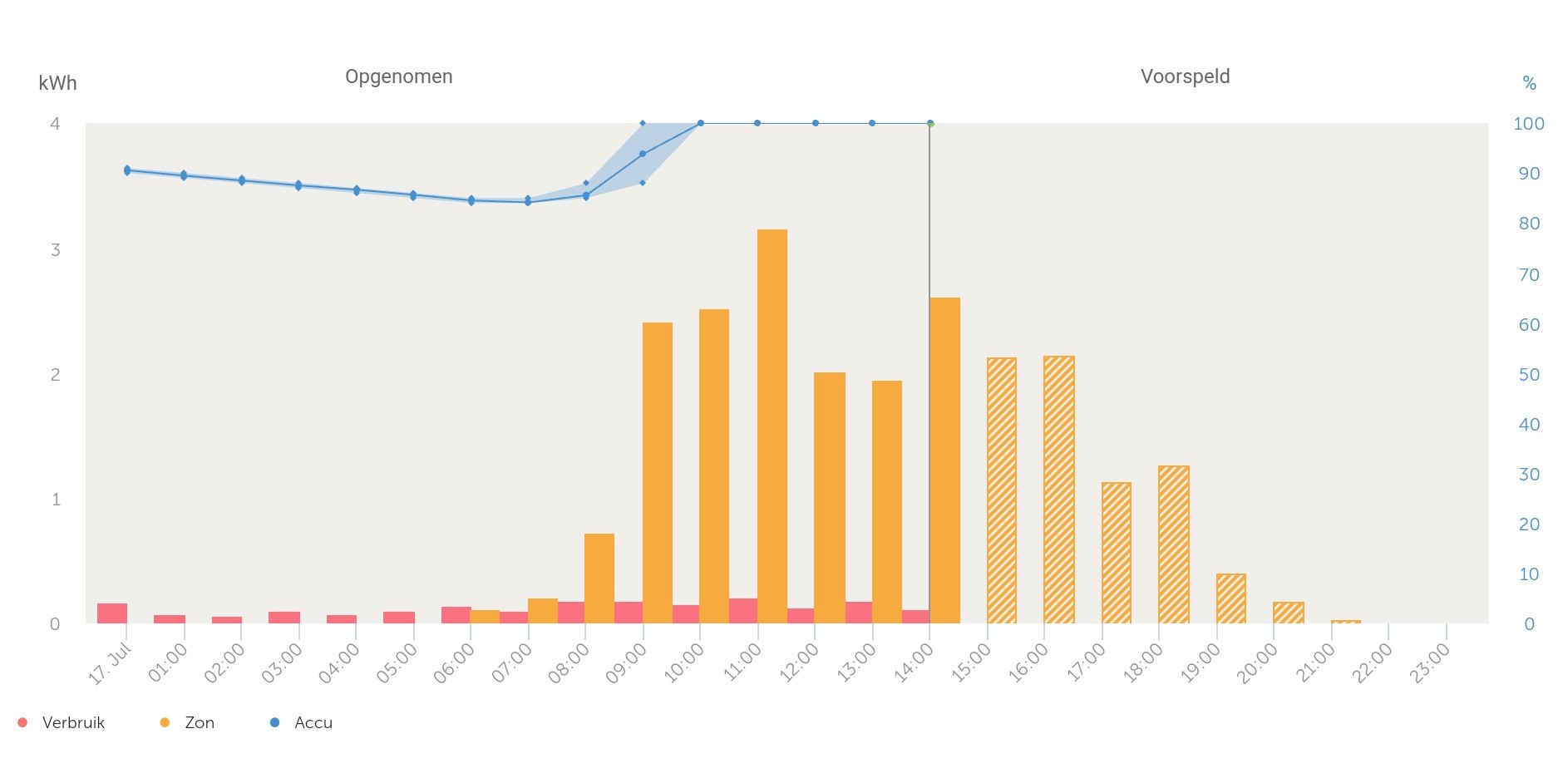
For a couple of weeks my dashboard graphs look a little something like this. I m trying to understand what it wants to tell me with the different shades of the same colour, but I cant seem to make any sense of it. It doesnt seem to be a couple of hour increments, its not for example bulk vs float state, it s just seems randomly colourful and then I liked it better before, can anybody shed some light on how to alter or meaning?
Cheers

