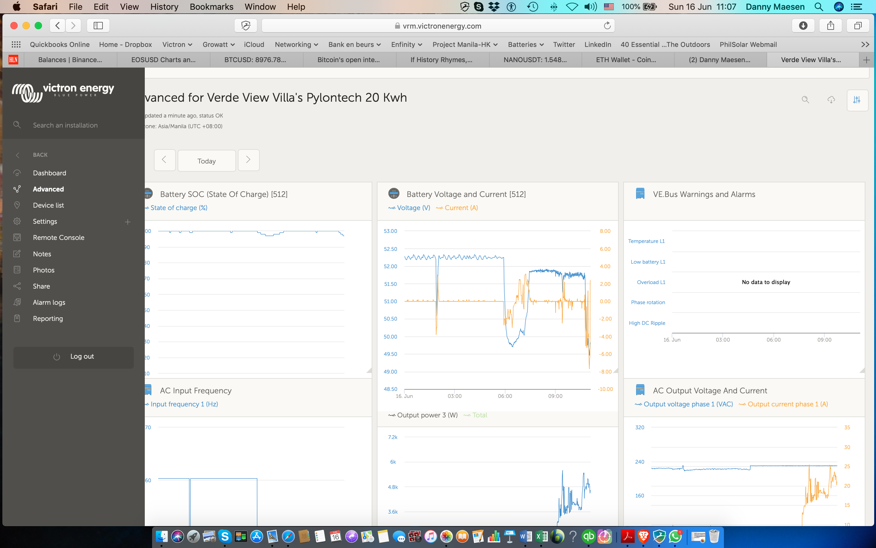
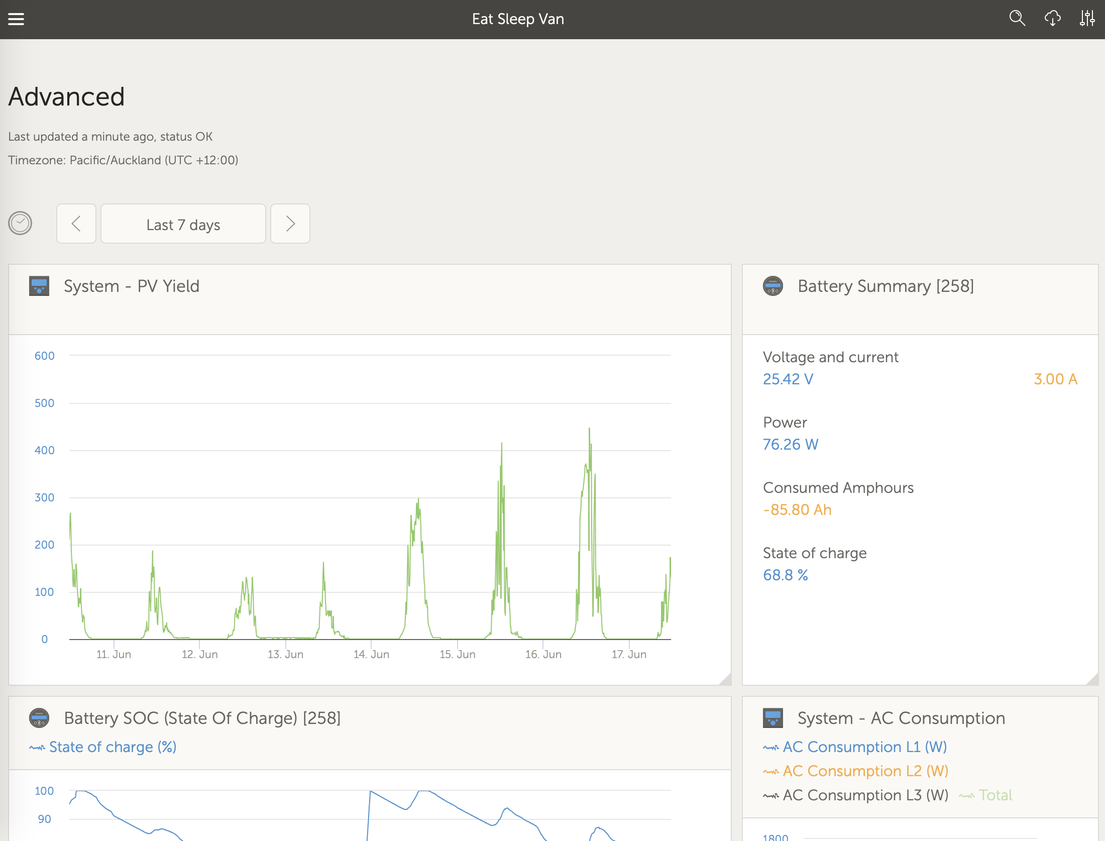
Hello, I work with a Macbook Air 13" and recently the layout for the widgets on the VRM Site have been changed, it seems that on the Macbook in Safari, the layout from 3 widgets in a row, does not fully fit anymore, besides that, it is a very unclear and non practical layout anymore, widgets cannot be moved anymore, and the setup from the widgets is chaotic, before we could organise the widgets the way we wanted, for example when you have 6 MPPT Chargers, you could organise the widgets per categorie, like all the PV Yields one under each other, all the PV Voltages and Currents under each other and so on, this was very practical and easy to manage and to find eventually system failures. Now its all very unclear, specially on a laptop, if you want to study a widget, you have to separately open it and its a hassle to do and get it back organised. I don't find this an improvement.
Kind regards,
Danny


