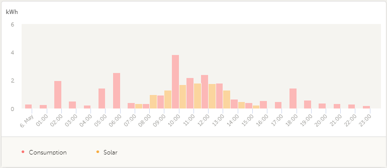
Is it possible to get a graph showing the average hourly solar and consumption (and battery SOC) for a longer period of time? Below graph is for just one day, but I'd like the same view over a couple of months, or a particular season.
When deciding how to expand or manage a system, either with more battery capacity or PV panels, or both, or managing consumption patterns, it would be useful to establish what the system's average day looks like for each hour and where the gaps are that need to filled or managed.


