
How do I adjust the index on chart showing on the portal: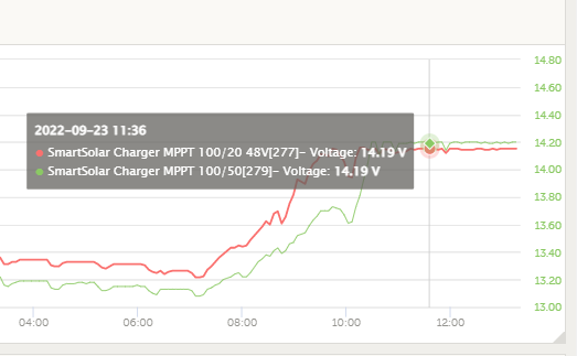
The charts are useless because the Y- axis is wrong or rather random scale!
Next example: red value and green value are both misplaced on the y-axis! They are roughly the same randomly shown.
This site is now in read-only archive mode. Please move all discussion, and create a new account at the new Victron Community site.
How do I adjust the index on chart showing on the portal:
The charts are useless because the Y- axis is wrong or rather random scale!
Next example: red value and green value are both misplaced on the y-axis! They are roughly the same randomly shown.
@claus@hemdrup.dk ...what is the "index" of a chart? I'm not sure how the chart could represent the data in a more meaningful way without losing the upper or lower extremes of the data. What do you need to see better?
First of all, sorry for my (iPhone) spell check.
The two Y value in the chart is the same, but the scale / index is set differently, so they are displayed incorrectly!
-when you read the red and green graph, which value is the greatest value?
you can simply not compare the data without reading the dataset (in the hoverbox)
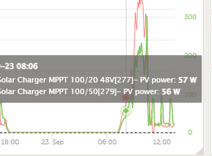
Another example of pointless scaling:
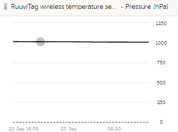
the index should be 950 -1050, to make sense for pressure measurement ;o)
Hi,
The VRM dev team is working on improving the Y axis control (and defaults).
Hopefully soon.
Thank you very much, I was about to fear that I developed OCD.