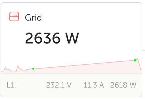
In the VRM Dashboard, grid outages (or disconnections) are not visualized correctly. In the following graph, grid was disconnected marked with the left green dot, and connected marked with the right green dot:

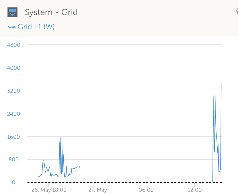
VRM interpolates these two with a straight line, which suggests there was a continuous grid connection with increasing grid usage. The advanced view is almost correct:

So I would very much appreciate if also the Dashboard visualization could be made more correct-ish.
