Hi Victron-Team,
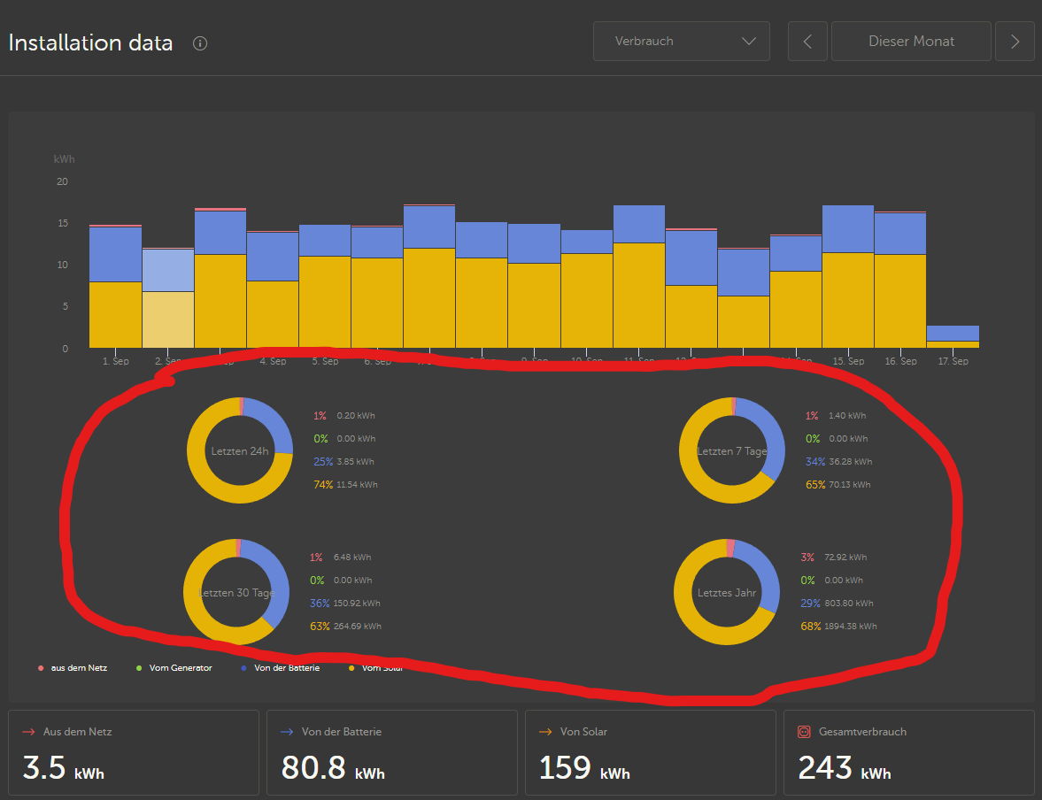
If I select a specific range (this month or with manual set of start and end) to display historial data VRM shows always the same four pie charts (last 24h, last 7 days, last 30 days, last year).

It would be nice if you could implement a pie chart which is showing the data from the selected range additionally.
Greetings from Germany
Henry
